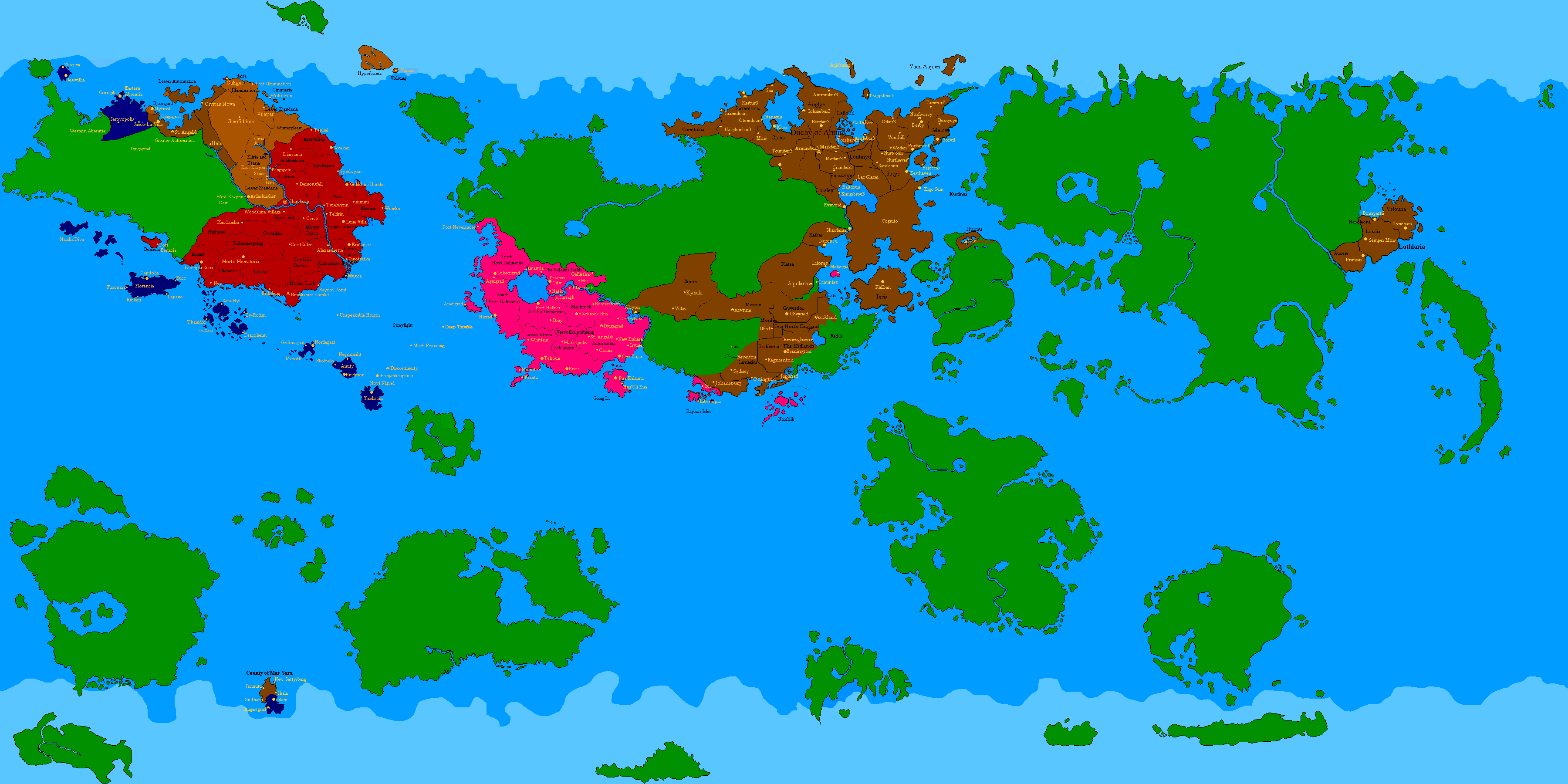
It's been uploaded to replace the old Mango Map (Empire.png). Don't worry all you recorders and archivers, I've reuploaded the old version as Empireold.png. It's just this way we don't have to change any other Maps pages. Though... it seems Wiki keeps a log... ah well. Oops.
(Refresh your page if it doesn't believe I updated it
 )
By the way, that map is fucked up. So many colours are messed up. There are many different colours used for the same thing - e.g. slightly lighter/darker greens for free territory, blues for ice caps, blues for seas. I would have standardised it but I'm not sure to what standard I would be bringing it. It's because the colours have been altered by image conversion and different palettes used by the various people editing the map - and this Mango Map, brilliantly pieced together by Harald, used loads of different versions, so he inadvertently put in many different colours.

 The entire URL please.