Page 1 of 2
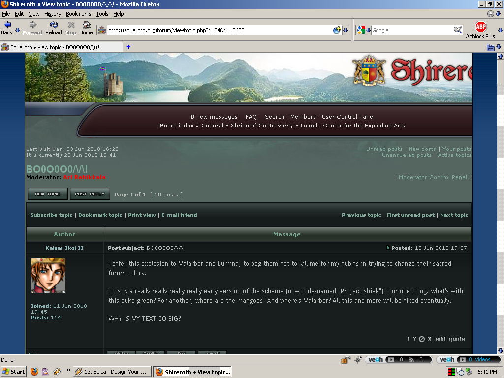
BO0O0O0/\/\!
Posted: Fri Jun 18, 2010 6:07 pm
by Kaiser Ikol II
I offer this explosion to Malarbor and Lumina, to beg them not to kill me for my hubris in trying to change their sacred forum colors.
This is a really really really really early version of the scheme (now code-named "Project Shiek"). For one thing, what's with this puke green? For another, where are the mangoes? And where's Malarbor? All this and more will be fixed eventually.
WHY IS MY TEXT SO BIG?
Re: BO0O0O0/\/\!
Posted: Fri Jun 18, 2010 6:22 pm
by Malliki Tosha
More red and blue.

Re: BO0O0O0/\/\!
Posted: Fri Jun 18, 2010 6:41 pm
by Daniel Farewell
I was wondering if it's possible to make the post boxes (boxes with text) less broad. Right not I have to scroll to the right to read what's here haha.
Otherwise, yay! 'bout time.
Re: BO0O0O0/\/\!
Posted: Fri Jun 18, 2010 6:44 pm
by CJ Miller
I like it. IMO much better than the old one.
Just get Ari to shoehorn in the Malarbox and it's ready for primetime.
Re: BO0O0O0/\/\!
Posted: Fri Jun 18, 2010 6:45 pm
by Harvey Steffke
For some reason this layout lags me where the other does not.
Re: BO0O0O0/\/\!
Posted: Fri Jun 18, 2010 6:46 pm
by Malliki Tosha
I really don't like the colors.

I like the background, but not much else.
Ric, perhaps a change of display settings would be in order?

Re: BO0O0O0/\/\!
Posted: Fri Jun 18, 2010 6:51 pm
by Elliot Markham
I'm just going to flat out say it: Shireroth has always had better themes than Antica. Moreover, if I were one of those newcomers to micro-nationalism who looks at stuff and thinks, "Oooh, shiny!" I would join Shireroth over Antica.
Re: BO0O0O0/\/\!
Posted: Fri Jun 18, 2010 6:52 pm
by Kaiser Ikol II
I was wondering if it's possible to make the post boxes (boxes with text) less broad. Right not I have to scroll to the right to read what's here haha.
That's odd. For me it's less wide than the old one. Must be percentage based or something. Ari could probably take care of that, but then I dunno what it would do to the banner.
Yeah, I don't like the colors much either right now. The main forum's not so bad, but here in the threads the greenness is overpowering. Thinking about starting over with the old style, giving it this background, replacing the bars, and calling it a day.
Re: BO0O0O0/\/\!
Posted: Fri Jun 18, 2010 7:20 pm
by Daniel Farewell
What if we centred the forum bit (text boxes) and made them less wide?
@Malliki, if i do that, the text will get so small that I can't read
Re: BO0O0O0/\/\!
Posted: Fri Jun 18, 2010 7:23 pm
by Shyriath
That's odd. For me it's less wide than the old one.
Ditto here.
The greenness is a bit odd, but I think that if it were made more grayish, or slightly grayish-blue, instead, that it would look pretty good.
Re: BO0O0O0/\/\!
Posted: Sat Jun 19, 2010 1:31 am
by Andreas the Wise
I'm liking the top; I'm not liking the width (it is too thin for me). From my experience, it shouldn't be too hard to mod that - it's probably a value in forum_body.html or equivalent file; and a matter of finding the size. If it's too big for Daniel, my guess is it's actually pixel based and not percentage based - if it were percentage based (as it should be) it should auto-adjust).
Re: BO0O0O0/\/\!
Posted: Sat Jun 19, 2010 8:34 am
by Jacobus Loki
Top banner looks good, but I also have to move over to read the whole thing. I liked the bigger buttons, but I'm old and grumpy.
Re: BO0O0O0/\/\!
Posted: Sun Jun 20, 2010 9:41 am
by Jonas
NIFTY!
If this one is finished, I want the Kildarian lay-out based on it!
Re: BO0O0O0/\/\!
Posted: Sun Jun 20, 2010 1:07 pm
by Erik Mortis
The colours are a problem for me. And the image, which I like, makes my screen scroll right.
But I find these colours hard to read. They actaully cause my eyes to start shaking and thus blur.... (my eyes already shake.. thes just make it worse).
If we bring the image to 75% of the current width that might help prevent scrolling. But this will be the flaw from not using a image like that as a banner.
I think I liked the old castle better too.
Re: BO0O0O0/\/\!
Posted: Sun Jun 20, 2010 6:08 pm
by Falkner van der Sluijs
Colours are a bit funny, and it would take a little getting used to, but ok, this is pretty cool.
Re: BO0O0O0/\/\!
Posted: Sun Jun 20, 2010 7:26 pm
by Chrimigules
I like where this is going. Agreed on the less wide suggestion. Is there a way to make it more variable width?
Re: BO0O0O0/\/\!
Posted: Sun Jun 20, 2010 8:02 pm
by Erik Mortis
Proly not since the image itself is a set width. Unless we can get it into a scalable format, and get a script that auto-sets the width for us.
but we need to remember, not everyone has a good connection.
Re: BO0O0O0/\/\!
Posted: Sun Jun 20, 2010 8:05 pm
by Chrimigules
Is it possible to anchor the background to the top-left corner and the "Shireroth" to the top-right corner, and have them overlap as necessary?
Re: BO0O0O0/\/\!
Posted: Wed Jun 23, 2010 5:06 pm
by Kaiser Ikol II
Can someone who was having trouble with the width of the forum before tell me whether it's better now?
Re: BO0O0O0/\/\!
Posted: Wed Jun 23, 2010 5:27 pm
by Malliki Tosha
It looks wider for me now, but I never had a problem.
Re: BO0O0O0/\/\!
Posted: Wed Jun 23, 2010 5:45 pm
by Erik Mortis
This is what I see. Not the issue with the Shireroth in the header.
Re: BO0O0O0/\/\!
Posted: Wed Jun 23, 2010 5:55 pm
by Malliki Tosha
Yeah. The banner is fixed to the left and has a set width in pixels, while the forum itself has a width in percent.
Re: BO0O0O0/\/\!
Posted: Sat Jun 26, 2010 3:31 pm
by Kaiser Ikol II
The mangos look as good as they're going to get for now, Erik's problem with the banner should be solved (right?) and the text isn't quite as big.
...although I always found the text in the original forum style small and hard to read. Do you want it back as big as it was before, or is this size okay?
Re: BO0O0O0/\/\!
Posted: Sat Jun 26, 2010 5:05 pm
by Falkner van der Sluijs
Scott, I'm technically blind without my glasses. With them on, I'm about a foot from my screen. Bigger please.
Re: BO0O0O0/\/\!
Posted: Sat Jun 26, 2010 5:38 pm
by CJ Miller
Pink? PINK??
PUT THE GREEN BACK! MALARBOR DEMANDS IT!
Re: BO0O0O0/\/\!
Posted: Sat Jun 26, 2010 5:58 pm
by Andreas the Wise
Yeah, this text is too small now for my liking.
Re: BO0O0O0/\/\!
Posted: Sat Jun 26, 2010 6:23 pm
by Kaiser Ikol II
It's not pink, it's...
Oh God.
I am an idiot.
I just did this entire forum style, while
F.lux was in its night phase and my entire computer was redshifted.
So this is actually much lighter and pinker than it looks on my computer.
AARARarAErSErfSE:OIRHESLKJHSDGLIUhRSLGKGGGHHH.
Re: BO0O0O0/\/\!
Posted: Sat Jun 26, 2010 7:02 pm
by CJ Miller
Maybe try again when F.lux is in day mode.

Re: BO0O0O0/\/\!
Posted: Sat Jun 26, 2010 7:04 pm
by Kaiser Ikol II
I disabled it and fixed a few of the problems...but I think I'm spent for the night. We'll see how much I can get done tomorrow. Anyway, i think it's coming along well.
Re: BO0O0O0/\/\!
Posted: Sat Jun 26, 2010 8:47 pm
by Erik Mortis
It's not pink.. it's light red..
You know what they call that....? PINK!