Page 1 of 1
flag design... more or less
Posted: Fri May 12, 2006 3:27 pm
by H4773r 3lfs0n
As I may have mentioned before I am an artist of words, which also means I have no visualy artistic ability, SO!
should anyone like to take my idea and expound upon it i would greatly appreciate it....
the aspectas are:
Kaikain K in one of its colors,
green, possibly blue,
a duality, yin yang sort of thing, for Alexandretta
A full moon for both Lunaris'
and something that represents the nature Ive molded for our Barony.
heres my first attempt....
http://www.geocities.com/t3h_h4773r/vorpmadal
oh, and the Barony website... if any of our residents would like to help me with ideas for it, id welcome that as well...
thanks![/img]
Posted: Fri May 12, 2006 3:29 pm
by H4773r 3lfs0n
by the way... to any admins who decide to stop in... Upper and Loewr Lunaris have flags in they're respective boards... if you could please put those up I would appreciate it....
Posted: Fri May 12, 2006 6:19 pm
by Braden Indianensis
Ah! I like the idea, but perhaps I could trim up the edges a bit with Paint? And come up with some crazy, Tolkienian symbol that will combine the K and the A?
HEre's what I've got, with a bit of changes here and there:
Posted: Fri May 12, 2006 10:15 pm
by H4773r 3lfs0n
actually I think after Rarkasha's flag Id like a little something else...
go ahead and brainstorm, im gonna be MIA until sun night or mon as its mothers day...
also, if anyone els eis playing Big Brother, if Baldwin and I could have modship over Kaikas, that would be peachy,
and the Banner for Upper Lunaris would look much better if it was the one that Hypatia doctored up in photoshop (scroll down in the same post... )
and for Lower Lunaris, please use the avatar Krasniy had, it fits so much better with the theme...
you guys are awesome!
THANKS!
Posted: Fri May 12, 2006 10:43 pm
by Kaiser Meskan II
Personally I prefer the flags that you guys have now. For Alexandretta, keep the old one. For Vorpmadal, why do you need to change it? The current one is fine, and looks much better anyway.
Posted: Sat May 13, 2006 8:07 am
by H4773r 3lfs0n
I agree the old Vorpmadal Flag is nice, but it's field is the Kitaunus Fields standard, and theyres no influences from Kaikais, or Alexandretta on it. Let alone from when Knappy gets a county and if he decides to join it..
OOH!
maybe we can use the field from Alexandretta, throw the full moon on it, and add the K or the Kaikain colors in there..?
Posted: Sat May 13, 2006 12:12 pm
by Braden Indianensis
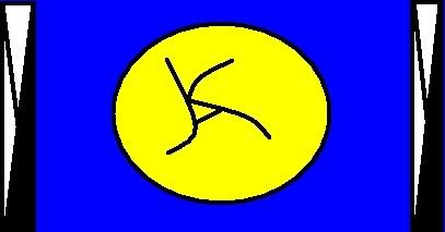
Perhaps we could do that, but get rid of the upside-down pine tree, and replace it with the "KA"?
Posted: Mon May 15, 2006 8:03 am
by H4773r 3lfs0n
hows this look, id like it doctored, but something like this?

Posted: Mon May 15, 2006 11:52 am
by Braden Indianensis
I like it!
Posted: Wed May 17, 2006 8:46 pm
by H4773r 3lfs0n
im okay with it if noone else comes up with something else.
if somebody volunteers to make a better, less blown up paint version I would be very thankful.
So yeah... Id like a better version of this, or even this shrunk might look better, and then have it as our icon... AND THEN ON TO AS PROPER BANNER!
so we can be cool like all the other cool kids
and by the way, Baldwin, get back to writting that novella! i wanna know what happens to the sad dumpy chick and her slutty best friend (lesbians much?)
and I fully intend on digging up aome of my old threads.. I promise.
HUZZAH!
Posted: Thu May 18, 2006 3:11 am
by Conglacio
cleaned up versions of the flag

and the alexandretta flag

Posted: Thu May 18, 2006 7:48 pm
by H4773r 3lfs0n
Conglacio, if you ever concider changing subdivisions, I would welcome you with open arms....
as long as you continue to do the icons thing
Heck, i might make you an honorary count for shits and giggles.
anyway, thanks again.
Posted: Fri May 19, 2006 2:20 am
by Conglacio
no problemo