Design-a-flag contest

A central forum for general discussion

Moderator: Kaiser Fish XII

User avatar
Scott of Hyperborea
Posts: 2816
Joined: Wed Mar 24, 2004 5:17 pm
Location: Ireland
Contact:

Design-a-flag contest

Post by Scott of Hyperborea »

The results of the poll are 85% in favor of new flag, so I think we can at least start tossing around ideas.

Please post all your ideas for new Shirerithian flags here. One person can post as many flags as they want (within reason). I'll wait a while, maybe until the beginning of February, maybe earlier, and then we can hold a poll using some system like Single Transferable Vote that doesn't implode when choosing between more than two possibilities. If there's a clear winner, someone can put it before the Landsraad to make it official.

Considering the gravity of this decision, I would want a Landsraad vote of >60% in favor. No point in replacing a bad old flag with a bad new flag; we've got to come up with something that most everyone agrees is better.

This thread is for designs. The flag doesn't have to be graphically perfect. If the winning design has a few pixels out of place, Bill or I or someone with expensive graphics software will work with the designer to create a finished version. But don't let it be so graphically bad that people can't appreciate it.

If you want to submit something anonymously, PM me and we can work something out. I don't see why this contest should be limited to Shirerithian citizens, although the vote on which one to accept should be.

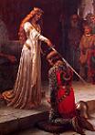
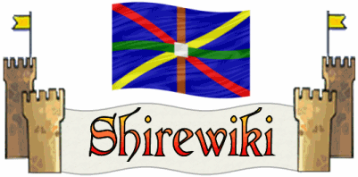
Please submit only simple designs. Something flashy and wavy like the flag here is nice, but that should be an extra created later, not the actual flag.

Some things you might (or might not) want to consider:
* The old flag is traditional, and the closer the new flag is to the old, the happier traditionalists will be.

* Dark blue and red are the traditional colors of Shireroth.

* European heraldry says all flags should follow the Rule of Tincture, which calls yellow and white "metals", other colors like blue and red and green "colors", and forbids a design where any color is on another color or metal is on another metal. So a flag with a red stripe on a white background is okay (color over metal), but one with a red stripe on a green background isn't (color over color). Most macronational flags follow this rule. Whether Shireroth does as well is for you to decide.

* Harvey says (and I kinda agree) that a good flag is one a six year old can draw.

* The North American Vexillological Association preach their views on flag design here. Warning: they're sort of flag nazis.

* You can find some inspiration (and links to more) here.

User avatar
AryezturMejorkhor
Posts: 562
Joined: Thu Jul 23, 2009 4:45 pm

Re: Design-a-flag contest

Post by AryezturMejorkhor »

Image

[Joke]
Aryeztur Mejorkhor

User avatar
Bill3000
Posts: 1684
Joined: Fri Apr 13, 2001 5:13 pm
Location: Apoltopoli, Audêntija Grakent, Kildare, Šireþe
Contact:

Re: Design-a-flag contest

Post by Bill3000 »

I made an SVG of the flag that Scott made.

http://bill3000.net/Shireroth/ShirerothFlag.svg
Senechal Bill Trihus of Greater Audentior
Citizen of Shireroth
Zor nukrô šempi zor fredrô

User avatar
Artz
Posts: 108
Joined: Thu Sep 11, 2008 8:31 am
Contact:

Re: Design-a-flag contest

Post by Artz »

Image

Re-vamp?

*Looks at the board forum colours..*.. heh.. quite close

If you want an artistic review of the middle circle.. I decided to add a lighter part and a darker part to it. One in the shape of a moon, and one of the sun. Make of it as you will.

Ryan
Posts: 1605
Joined: Thu Mar 08, 2001 6:15 pm
Location: The Saran Isles, Yardistan
Contact:

Re: Design-a-flag contest

Post by Ryan »

Going back to the idea I suggested in the Oustfest thread.

Image
Oh ye who torments me in dreams of dark abysses, beware the sleeping shadow, for it is a bane like no other...
-The Sorcerer of Korgun-Amoth

User avatar
Bill3000
Posts: 1684
Joined: Fri Apr 13, 2001 5:13 pm
Location: Apoltopoli, Audêntija Grakent, Kildare, Šireþe
Contact:

Re: Design-a-flag contest

Post by Bill3000 »

Here's a simple flag with reduced, symmetric colors.

Image

http://bill3000.net/Shireroth/BadIdea1.svg

Comments?
Last edited by Bill3000 on Fri Jan 15, 2010 12:04 am, edited 1 time in total.
Senechal Bill Trihus of Greater Audentior
Citizen of Shireroth
Zor nukrô šempi zor fredrô

User avatar
Malliki Tosha
Posts: 2516
Joined: Wed Aug 26, 2009 10:43 am

Re: Design-a-flag contest

Post by Malliki Tosha »

And the file name says it all.
Malliki Tosha
Owner, Mortis Mercatoria FC
Owner, Newport City FC

User avatar
Bill3000
Posts: 1684
Joined: Fri Apr 13, 2001 5:13 pm
Location: Apoltopoli, Audêntija Grakent, Kildare, Šireþe
Contact:

Re: Design-a-flag contest

Post by Bill3000 »

Senechal Bill Trihus of Greater Audentior
Citizen of Shireroth
Zor nukrô šempi zor fredrô

Gareth Arthur
Posts: 230
Joined: Mon Dec 21, 2009 10:57 am
Location: Port Nevermore, Nova Dalmacija
Contact:

Re: Design-a-flag contest

Post by Gareth Arthur »

Image

This is eerily similar to the flag of Macedonia with different colors and a modified center...

Image

Both give me a headache. :(
Last edited by Gareth Arthur on Fri Jan 15, 2010 12:25 am, edited 6 times in total.
Gareth Arthur X
The Count of Nova Dalmacija

User avatar
Malliki Tosha
Posts: 2516
Joined: Wed Aug 26, 2009 10:43 am

Re: Design-a-flag contest

Post by Malliki Tosha »

Reminds me too much of the flag of the Åland Islands.
Malliki Tosha
Owner, Mortis Mercatoria FC
Owner, Newport City FC

User avatar
AryezturMejorkhor
Posts: 562
Joined: Thu Jul 23, 2009 4:45 pm

Re: Design-a-flag contest

Post by AryezturMejorkhor »

I like Bill's flag.
Aryeztur Mejorkhor

User avatar
Bill3000
Posts: 1684
Joined: Fri Apr 13, 2001 5:13 pm
Location: Apoltopoli, Audêntija Grakent, Kildare, Šireþe
Contact:

Re: Design-a-flag contest

Post by Bill3000 »

I'm trying to think of a way to get a white something in the middle of the flag but I cannot think of a way that doesn't look completely awful.
Senechal Bill Trihus of Greater Audentior
Citizen of Shireroth
Zor nukrô šempi zor fredrô

User avatar
Scott of Hyperborea
Posts: 2816
Joined: Wed Mar 24, 2004 5:17 pm
Location: Ireland
Contact:

Re: Design-a-flag contest

Post by Scott of Hyperborea »

Image

Actually, that one's giving me vertigo. I agree it looks better without the white, but this could be a good compromise design. I think Erik said he was willing to accept some color changes if we kept the overall shape.

Ryan
Posts: 1605
Joined: Thu Mar 08, 2001 6:15 pm
Location: The Saran Isles, Yardistan
Contact:

Re: Design-a-flag contest

Post by Ryan »

I honestly like having the four color bars. Those look way too British.
Oh ye who torments me in dreams of dark abysses, beware the sleeping shadow, for it is a bane like no other...
-The Sorcerer of Korgun-Amoth

User avatar
Bill3000
Posts: 1684
Joined: Fri Apr 13, 2001 5:13 pm
Location: Apoltopoli, Audêntija Grakent, Kildare, Šireþe
Contact:

Re: Design-a-flag contest

Post by Bill3000 »

Here's another one, with a diamond instead of a square.

Image

http://bill3000.net/Shireroth/BadIdea4.svg


...and another one with the gold bars over the red bars.

Image

http://bill3000.net/Shireroth/BadIdea5.svg

...and one with thinner bars, no white spot..

Image

http://bill3000.net/Shireroth/BadIdea6.svg
Last edited by Bill3000 on Thu Jan 21, 2010 2:43 pm, edited 1 time in total.
Senechal Bill Trihus of Greater Audentior
Citizen of Shireroth
Zor nukrô šempi zor fredrô

Iskander Mirkdale
Posts: 270
Joined: Wed Jan 31, 2007 3:11 pm

Re: Design-a-flag contest

Post by Iskander Mirkdale »

Based on Bill's flags, with reference to the Rules of Tradition, the Rules of Tincture and the Rules of Treesia:

A Mango Flag:
Image

A Coat of Arms Flag:
Image

A Malarbor Flag:
Image
The Earl of Eliria and Utasia
MNN, MMR, AFV, II

User avatar
Kaiser Leto III
Posts: 540
Joined: Wed Dec 23, 2009 10:58 am

Re: Design-a-flag contest

Post by Kaiser Leto III »

I don't want to be the bad guy, but all those flags remember me of the UK.

I like the flag made by Ryan, just like I love the flag made by Scott (currently the flag of the Imperial County).
Signed by the Nifty Hand of,
Leto III Ozymandias 'the Desired' of the Noble Line of Win'Eth

User avatar
Scott of Hyperborea
Posts: 2816
Joined: Wed Mar 24, 2004 5:17 pm
Location: Ireland
Contact:

Re: Design-a-flag contest

Post by Scott of Hyperborea »

Those flags don't remind me of the British flag any more than the old flag did, or any more than the Bulgarian, Estonian, Georgian, Basque and Latvian flags do.

Once you get to flags that basic, design duplications are very common. I think anything that looks at all like the old Shirerithian flag but with thicker bars (which most people agree we need) is going to look a little British.

Ryan
Posts: 1605
Joined: Thu Mar 08, 2001 6:15 pm
Location: The Saran Isles, Yardistan
Contact:

Re: Design-a-flag contest

Post by Ryan »

I don't know how feasible it is, and maybe I'll try it myself during the week when I have time; but how about making the bars wavy like the Assyrian flag?

I can't get over the awesomeness of this flag.
Image
Oh ye who torments me in dreams of dark abysses, beware the sleeping shadow, for it is a bane like no other...
-The Sorcerer of Korgun-Amoth

User avatar
Harvey Steffke
Posts: 1599
Joined: Sat Feb 23, 2008 9:28 pm

Re: Design-a-flag contest

Post by Harvey Steffke »

I knew it was only a matter of time before someone suggsted a mango on the flag. I should have put money on it.

Ryan
Posts: 1605
Joined: Thu Mar 08, 2001 6:15 pm
Location: The Saran Isles, Yardistan
Contact:

Re: Design-a-flag contest

Post by Ryan »

Alright, I did it.

I really like how this looks.

Sorry ahead of time for the image size...

Image
Oh ye who torments me in dreams of dark abysses, beware the sleeping shadow, for it is a bane like no other...
-The Sorcerer of Korgun-Amoth

Shyriath
Posts: 1790
Joined: Fri Feb 28, 2003 9:41 am
Location: Sunderspray, Shireroth
Contact:

Re: Design-a-flag contest

Post by Shyriath »

Mind you, my default position is that I prefer the old flag. But since it looks like a change will happen regardless, I have to say I'd prefer the first one Ryan mentioned in this thread, with the straight rays. As for his second, the Assyrian flag is indeed nifty in its own right, but I don't think I like the way it translates to a Shirerithian flag. The others can at least deal with, although I have to say I'd vastly prefer that they keep a majority of the colors (sorry, Bill).
Image

Gryphon Avocatio
Posts: 2447
Joined: Wed May 01, 2002 6:59 pm
Location: California
Contact:

Re: Design-a-flag contest

Post by Gryphon Avocatio »

I agree with the view that the cross on satire designs are all too reminiscent of the UK flag, amongst others.

In fact, none of these are really that appealing. Of all of them, I like Artz's the best, in principle, with Iskander Mirkdale's being second, and here is why:

1) It is still recognizable as the Shirerothian flag.
2) It fixes one of the real problems with the True Flag of Shireroth--the fact that the colors don't go well together.

Unfortunately, the bars are all of different sizes, and I don't really get the ball in the center. Like I mentioned, I think that the real issue with the current flag is that all of those colors are default colors available in mspaint.exe. If you tweak with them a bit and even them all out, the flag starts looking a lot nicer, IMHO. See the attached png for a sort of proof of concept.

Anyway, if we must change it, as people here seem apt to do (or, at least, as people like Scott seem apt to push), I suggest that what we really do is simply make the current one less loud by balancing out the colors in some artistically principled way.
Attachments
rostest.png
rostest.png (6.02 KiB) Viewed 31686 times
- Gryphon Avocatio
  • Minister of Dance, Pants, and Funny Walks
  • Count of Yardistan
  • De facto Shirerothian Conlanger
  • Brother of Metal

"Kju De Ji de Cîkrdo, ce nja Le tene fevi Ânrsa, Je Li pode hajj Hâlamaj, Lâdrmaj, me Xkuêlamaj."

Image

User avatar
Bill3000
Posts: 1684
Joined: Fri Apr 13, 2001 5:13 pm
Location: Apoltopoli, Audêntija Grakent, Kildare, Šireþe
Contact:

Re: Design-a-flag contest

Post by Bill3000 »

While I understand that people don't want a UK clone for a flag, (Although that could possibly make sort of sense, considering Erik's odd use of British slang that's so dear to our nation! I miss being called a stupid git :( ) the problem is that in the limit of more Shirerothian colors, the flag looks bad, IMO. It's just way too busy looking - the problem isn't the particular values used, although that's certainly a large problem, but the amount that's there. Remember that a flag, ideally speaking, has to be viewed at a distance, and too many colors add to the distraction.

If we could like eliminate the brown color and make it blue background with red/white/yellow/green, I can tolerate that, although the problem is finding a design which is still reminiscent of Shireroth with symmetric colors. I'll explore more stuff later today.
Senechal Bill Trihus of Greater Audentior
Citizen of Shireroth
Zor nukrô šempi zor fredrô

Ryan
Posts: 1605
Joined: Thu Mar 08, 2001 6:15 pm
Location: The Saran Isles, Yardistan
Contact:

Re: Design-a-flag contest

Post by Ryan »

The brown now is almost like a sedona red. Therefore it would not be too much of a stretch to turn it into a deep gold, which might look better and less out of place among the brighter colors of the other bars.

To me the most glaring problem with the flag, besides widening the bars (which Nick did nicely), is that central block of white. It looks odd and out of place. If we took Nick's cleaned-up version of the flag, and replaced the white block with the 8-pointed star, it would look more finished and intentional. And I think that would constitute a very minimal change from the original flag, which I would be fine with.

P.S. You're a stupid git, Bill. :p
Oh ye who torments me in dreams of dark abysses, beware the sleeping shadow, for it is a bane like no other...
-The Sorcerer of Korgun-Amoth

Gryphon Avocatio
Posts: 2447
Joined: Wed May 01, 2002 6:59 pm
Location: California
Contact:

Re: Design-a-flag contest

Post by Gryphon Avocatio »

Ryan, I actually didn't change the width of the bars at all. That seems to be an effect of making the shade of the colors more similar, and also possibly by framing it in the box like I did to isolate it from the board colors which don\t really match.
- Gryphon Avocatio
  • Minister of Dance, Pants, and Funny Walks
  • Count of Yardistan
  • De facto Shirerothian Conlanger
  • Brother of Metal

"Kju De Ji de Cîkrdo, ce nja Le tene fevi Ânrsa, Je Li pode hajj Hâlamaj, Lâdrmaj, me Xkuêlamaj."

Image

User avatar
Andreas the Wise
Posts: 5253
Joined: Sat Oct 27, 2007 10:41 pm
Location: The Island of Melangia, Atterock, Kildare
Contact:

Re: Design-a-flag contest

Post by Andreas the Wise »

I like the idea of the star in the centre.
The character Andreas the Wise is on indefinite leave.
However, this account still manages:
Cla'Udi - Count of Melangia
Manuel - CEO of VBNC. For all you'll ever need.
Vincent Waldgrave - Lord General of Gralus
Q - Director of SAMIN
Duke Mel'Kat - Air Pirate, Melangian, and Duke of the Flying Duchy of Glanurchy

And references may be made to Vur'Alm Xei'Bôn (a Nelagan Micron of undisclosed purpose).

User avatar
Scott of Hyperborea
Posts: 2816
Joined: Wed Mar 24, 2004 5:17 pm
Location: Ireland
Contact:

Re: Design-a-flag contest

Post by Scott of Hyperborea »

I don't see Nick's as solving the problem of the design being fundamentally bad (for example, the red-yellow cross is still a completely different brightness than the green-brown one) - but in the category of "more or less the same as the old one", I prefer it to Artz's and Iskander's, both of which look old and faded and needlessly complex in the center. I still prefer Bill's and Ryan's.

Gryphon Avocatio
Posts: 2447
Joined: Wed May 01, 2002 6:59 pm
Location: California
Contact:

Re: Design-a-flag contest

Post by Gryphon Avocatio »

Scott of Hyperborea wrote:I don't see Nick's as solving the problem of the design being fundamentally bad.
I don't understand why you believe it is fundamentally bad.
Scott of Hyperborea wrote: ...the red-yellow cross is still a completely different brightness than the green-brown one.
Yes. That's called contrast. Again, I don't understand why this is a problem, since the flag would look like a goddamn color wheel if they were all the same brightness.
- Gryphon Avocatio
  • Minister of Dance, Pants, and Funny Walks
  • Count of Yardistan
  • De facto Shirerothian Conlanger
  • Brother of Metal

"Kju De Ji de Cîkrdo, ce nja Le tene fevi Ânrsa, Je Li pode hajj Hâlamaj, Lâdrmaj, me Xkuêlamaj."

Image

User avatar
Scott of Hyperborea
Posts: 2816
Joined: Wed Mar 24, 2004 5:17 pm
Location: Ireland
Contact:

Re: Design-a-flag contest

Post by Scott of Hyperborea »

I'm not good at talking aesthetics, but it's something like - the red and yellow stand out well from the blue background. That sets the eyes to expect a certain contrast level. Then you can barely see the green and brown and you're like "Huh, what's that there?" and then you have to look closer and grudgingly put in extra mental effort, and then once you've adjusted to that contrast level when you see the red and yellow it's like aaaugh my eyes my eyes. The arrangement with all of them intersecting just amplifies the problem.

Then again, these are just my personal tastes - but judging from stuff like the Antican radio show, it sounds like a lot of people agree.

Post Reply

Return to “General Discussion”

Who is online

Users browsing this forum: No registered users and 45 guests